Statement of intent:
For my portfolio, I intend to show very clear photos which are broad and show messages of very important topics such as feminism and racism. The theme of the project is messages which I personally chose so I can express my opinions through the use of my passion of photography. I firstly chose to look at different photographers who I wanted to impersonate I really love Barbara Kruger's style as it shows a very clear message of what she is trying to communicate. I am looking at the variety of ways messages can be perceived such as text, expressions and different settings. I will also be looking into the history of these issues due to knowing more information will allow me to create a deeper connection to the topics. This shows how I have deeply thought about the images I want to be able to capture. When I first chose this theme I didn't realize how many different paths you could go down to explore messages due to the variety of artists who don't just want to create an exceptional piece of work but want to convey a deeper message too. I want to experiment at many different ways in order to see things from different view points. I believe research will allow me to find out way more not only about my chosen topic but also different techniques which will best allow me to capture the image I want to capture. As I progress more with this theme in my portfolio, I want to be able to develop my skills by using photo shop. This will allow me to use different tools in order to edit my photos. I will be able to play around with the tools on photoshop such as double exposure edits and layering photos for effect. I will be able to incorporate some of the edits from my portrait into this theme. I will follow many different tutorials by using you-tube. If I run into any difficulties while editing I will try and overcome any challenges I face. I hope to complete this project to an impeccable standard. I hope to have put together an end gallery which showcase all my images. I hope these images leave my audience feeling inspired and to look up to and feel empowered almost through my images I create.
Mind map:
Barbara Kruger: Analysis 1 for messages:

Context:
Barbara Kruger is an artist who works in a contemporary style of photography. Kruger was born in Newark on the 26 of January 1945. She is a well known photographer best known for her combination images that conveys a powerful message associating with many issues including inequality towards females. Her work displays the stereotypes of the social injustice towards females which still continues until this very day so it spreads an important and powerful message to the public. This poster was made on 30/06/89 for the pro-choice protest. This image was purposely made to to look at the Texas abortion law. I really like researching and looking at Kruger's unique, distinguishable, creative style because I like how she is able to send a clear message to others about a huge global issue as it is still huge to this day and mounds of protests occur demanding the same treatment. This work is very strong and today it still occurs today when women are pushed into things they don’t want due to the dominance of men in society so even though it's an old image it's still well known and iconic until this day and age.
Content:
This picture is called “Your body is a battleground” and it's a portrait poster photograph showing a message in regards to inequality. I believe the title fits the image perfectly but without knowing the name you could still lean to it being about inequality due to the word “battlefield” used on the image as it relates to conflict and war. Kruger works with text (word art) which she develops on her computer and prints them for a bill board size. The model's face is divided into halves in the picture. Half of the image is a normal black and white but the other half the model's face is in negative form. This may have purposely been used to embody the lack of power and control over their own bodies. I can also imply this as negative is used in crime documentaries nearing death which could show how even though it's their own body they still are not allowed to do everything. Kruger included advertising of text with the powerful choice of words “Your body is a battleground” in bold to really draw the attention of the audience and to show how it's a woman's own body and she should have the right to do so. Kruger created a very iconic and stand out image for the sole purpose of the Women's protest in 1989. The negative feedback is almost like an ultrasound looking more in a clinically observing women and giving no thought into her choice and how she almost doesn't matter in this situation. Her work was so powerful it was noted in the book “ Love for sale” by Nils Johan Ringdal. Which shows how inspirational her work is and how deeply her work connects to others. The women in the photo has an extremely symmetrical, stern and simple facial expression which is extremely effective in this topic as it is powerful due to her almost looking directly at the audience and being the 'typical' beauty standard of that time. Almost holding 'you' for account. Her pronoun choice of 'you' makes it seem more of a direct message and brings the audience in more to look at these huge social issues which still continue today. Kruger uses Futura Bold Oblique or Helvetica Ultra condensed text. The chosen colour red is bold and creates a tabloid newspaper feel. Purposely, media is incorporated into this work to show how not everything you see is real and today in society as a whole almost base everything they do on media they see even if its fake.
Composition:
This poster is a portrait where the model is in half with one half in black and white (positive exposure) and the other in negative exposures with a stark line to dissect the image apart. This is to show the two different sides as there is two sides to the argument which are for and against abortion. However, due to the layered text on top of the model and to the left and right of her we can see how this isn’t just politics it's about women not being able to control their own bodies. This picture doesn’t just evolve around abortion it goes into the wider topics of not having the same amount of freedom and the different struggles women face. When first looking at the image my eyes were drawn to the use of symmetry of the model's face as it's the same reflection but in a different exposure. This allows us to uncover as an audience to understand it's not just women it's a representation of society and the beliefs of some people towards the topic of inequality. I am also drawn by the voluptuous lips of the model. Kruger constructed a face of how a ‘typical’ woman should appear. Kruger's style is very distinct and targets mature topics with text layered on top and towards the right and left side of the models face with. Kruger has her model directly looking at the camera to show a clear and effective long stare. The artist would have used a high depth of field to capture all the minute details of the model's face and could have possibly used a tripod to keep the face extremely centered.
Comment:
I really like Kruger's style. Not only does she create extremely clear work she portrays important messages which not only can allow people to connect but to also be inspired by. In this case she is looking at patriarchy and the empowerment of women. In this piece of work I also like how she uses exposure on her images as it turns it into more of a political aspect of photography. However, the only dislike is that for some areas of the text it's hard to read from far away but this may have been purposely done to make people more intrigued. I am beginning to create a new page entitled messages to share my political opinions and strong beliefs towards certain topics. This links to mine as in her work she sends messages through colour, text and emotion which is what I want to imitate going into my project. For future shoots I would like to experiment with text on top of my work and using negative exposure. Kruger highlights very big issues and looks at the world women live to and how high the standards are and how when women make choices of appearance or having abortions they should decide as 'Your body is your battlefield'.

'Cleaning the drapes'- Martha Rosler
Context:
This piece of work is called 'Cleaning the drapes' which is part of the “House Beautiful: Bringing the War Home” collection. This collection is very iconic, consisting of twenty photomontages based around war and conflict. Rosler understood that war had been entertainment for the people. She also knew that the women were almost there to observe and be cheerleaders. While the men went to fight in the Vietnam war due to lots of sexism at the time. Rosler is a conceptual artist who appropriates small elements of pop culture in her work such as advertising towards certain topics such as conflict. It highlights the gap between women and men during that time. Due to most women working in domestic environments. This also is a huge eye opener to see how the media can switch things which link to the present day context. To show how what we see differs to what actually is happening due to things being twisted and made into something it truly isn’t.
Content:
This piece of work in 1967-72 and around that time the Vietnam war was taking place. Her work is very unusual as she splices together certain aspects of the war and Vietnamese citizens from Life magazine to depict the true reality of war. For the description of war and conflict as “the living room of war”. This image is a part of an exhibition/ collection of images from “House Beautiful: Bringing the war home” which is filled with images which have been sliced to show the true reality of wars. The Vietnamese war was a very long war with more than three million people being killed. So this image is not only to show the gap but to also portray a very important war in history where many lost their lives. Rosler's work focuses on political issues such as war in this image above to not only show a powerful message but to also challenge huge social issues. These issues may not directly link to people but it still makes the audience consider the role that social media especially nowadays does to affect people's opinions and choices.
Composition:
Rosler constructs her work by taking certain areas of advertisement from magazines and cutting them out. To create her own art. In this image there is a woman in the foreground of the image (who is in black and white) in old fashion clothes. This purposely done to portray women in the late- 1960s. She is almost painted to be a very typical woman due to her cleaning the drapes which in the image is the only hint of a creamy mustard tone of yellow. However, in the background, which is framed by the drapes, we see a large war scene due to two soldiers standing while wearing army gear and helmets as if they are having a break. We can see the true horror of war as the soldiers have laid down their machine guns at this moment in time and the sky seems extremely ominous and dull creating a gloomy tone towards the image. This image was truely to show the true reality of conflict and the irony is so blatantly clear as it's the true representation of how men went to protect and women mainly stayed at home due to the huge amount of sexism at the time.
Comment:
I really like her work as it shows a very powerful message of war. Her work is extremely original as I have never seen her type of style before which makes her unique and her work stand out from the crowd. She uses two opposing ideas of a ‘House beautiful’ and ‘bring the war home’ which are two completely contrasting ideas. I like the use of black and white in her work which creates a much more dramatic tone to the piece. She tends to focus on topics which keep make her audience's eyes open to the true reality of what is happening instead of being blinded by all the press and media.
Loira K: 'My Body My Choice'.

Context:
Loira K was born in 1988 in Northern New Jersey in a very small town. She was born to a conservative family. She’s a feminist because she doesn’t want to like in a world where “ I am defined, limited, and categorized by my genitalia, where women are objectified beyond reason, where rape culture thrives, and where these injustices (and more) are so blatantly ignored and denied by so many people.” She was told by her parents that the only thing limiting her was herself. She was told to never let her goals feel achievable. Which shows all the way from her childhood she was highly inspired and supported to never give up on her dreams. When Loira Graduated and finished school she moved around a bit and worked many different jobs alongside doing photography as more of a hobby. She always had a passion for fashion, art, portraits and macro but she never knew her full potential. As she experimented more with photography and gradually improved she knew that was something she wanted to take more seriously.
Content:
This image ‘My body my choice’ is part of a series called ‘Feminism’ which was started four years ago by Loira K she decided to create this work due to her battle for Women's rights in Arizona. Loira is a very inclusive photographer and aimed for her models to directly choose what statement they wanted such as ‘Sexism hurts everybody’ and ‘Your ignorance is more scandalous than my promiscuity’. These portraits are used to show the fight back against sexism by painting strong and powerful messages onto the bare skin of her models. Loira K has stated that ‘Don’t whistle, I’m not a dog’ to highlight the divide still to this day between the genders. She stated that the best way to get your true opinion and message across was to wear it with full pride. “I moved to Tucson, Arizona, in 2010, and it was my first time in a red state,” Loira, 27, tells Daily Mail Online. Loira said “I found it difficult to deal with because there were stacks of bills being put through to restrict women’s rights in the reproductive sphere. So I began calling representatives and signing petitions, and doing everything I could.” Loira K wanted to show her true anger and emotions towards this subject which she significantly links to. Purposely, Loira chose to have nobody under the age of eighteen in the shoot “I also didn't include anyone under 18, because adults come from a place of knowing,” This would also allow the meaning of what she wanted to portray to not be lost in the process. This shoot was not only for her but it was a way for Loira to connect to the women she did the shoot with to see their perspective on things to openly share their opinions and views on the situation.
Composition:
In this photo there is a woman who is faced with her back towards the camera (as the central focal point) with her arms up to show strength and power. Written on her back in white writing ‘My Body My Choice’ which is a feminist slogan used a lot when in the context of body image and abortions. This photo is in black and white to really define the writing on the womens back. Purposely, the artist may have done this to take no attention from the meaning. Loira chose to photograph her models semi nude to be bold and show how all bodies are different and your body is your body. Loira positioned her model extremely central to show that you need to look and this message is very important. In this photo the background is a plain black piece of paper and the foreground is the model herself. I feel that Loira took this photo without a tripod due to the fact that the image is at a slight worm's eye view. Due to this photo being black and white I can't specifically state the white balance but I do know the ISO would be low as there's no noise present in the photo.
Comment:
I really like Loira K’s work due to her using the choice of black and white portrait photography. She also focuses on the inequality between the genders which is a very controversial topic and it still is present today but it's more aware in society. All her images show how passionate Loira is towards feminism due to her having her own experiences. All her photographs inspire others and show her thoughts very thoroughly.
Barbara Kruger:
Barbara Kruger is an artist. She is most known for her work with text. Her work is always about a issue. Kruger wanted to sell an idea to her audience in a creative way. Her work often includes quite direct pronouns such as "you", "we", "your" and "they". This shows how these messages are quite strong as its a way to address issues such as power, identity and sexuality.
Barbara Kruger is an artist. She is most known for her work with text. Her work is always about a issue. Kruger wanted to sell an idea to her audience in a creative way. Her work often includes quite direct pronouns such as "you", "we", "your" and "they". This shows how these messages are quite strong as its a way to address issues such as power, identity and sexuality.


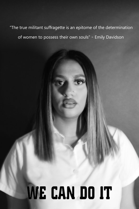
Messages through words:
I have chosen to do a shoot where I find meanings in different forms of text. The photos below all show very important messages and connect to my chosen shoot. I want to engage my audience and I aim for them to not only feel like my photos are clear and professional but I want them to learn an important message and feel that they are highly inspirational.


PHOTO SHOOT with scrabble letters:


Land girl posters:
The Women's Land Army made a significant and important contribution to getting Britain's food production increased during WW2. The women's land army was created in 1917 so women could work in agriculture and increased the growth of food.
The Women's Land Army made a significant and important contribution to getting Britain's food production increased during WW2. The women's land army was created in 1917 so women could work in agriculture and increased the growth of food.


Plan for Shoots
Name: Emily Moorhouse
Project Title/ shoot number: Feminism
Description of aims for shoot: I aim to send a direct message through the text and capture clear, no noise and professional photos to my audience about the inequality between. I am aiming to do a range of different images all focusing on feminism and inequality.
Links with Photographers
For this shoot I am inspired by the photographer Barbara Kruger who through her images is able to convey a very direct message about the inequality between men and women. I am going to take some of her poses her models do to portray power and strength.
Location: I will be taking images in school/indoor shoots.
Props/ items needed: Phone/tablet, money- monopoly money or printed cash, table, chairs.
Kit needed e.g. lighting, tripod, backdrop, macro lens: I will need a tripod, camera, lights
Camera settings I will use:
F-Stop : I want to position my models very central in my photos so I want my background out of focus. So my f-stop will be around F4.0.
White Balance: I want to do my shoot inside. I will be using a spotlight that will allow me to capture all the minute details.
Shutter speed: I want my shutter speed to be around 1/100 if held with my hand. This will allow me to achieve the best result as too high could change the lighting which would affect the end result.
ISO: I want my ISO to be around 200 as this is just right when using bright light. This will also make my photos look less noisy.
Which compositional rules will I use?
Barbara Kruger: I want to test a range of compositional rules to see which one fits best. I will start by using odd and even numbers of models. When using odd numbers you usually create a more natural photo and it is usually more interesting and fitting. Whereas, when using even you get a very ordered photo. I also want to experiment using the rule of triangles. The rule of triangles can be very good to use because you will have a more centered and main focal point. When taking my photos I think I will take them from a birds eye view so I get an overview. However, I might change and take photos from different perspectives like the worm's eye view.
Loira K: I will be working in black and white like Loira and have something always being the central focal point.
close up's:


Portrait:


Posters:
Braylon Dion:


Inspiration: Black and white photos


Inspiration: In colour


Pinterest homework:


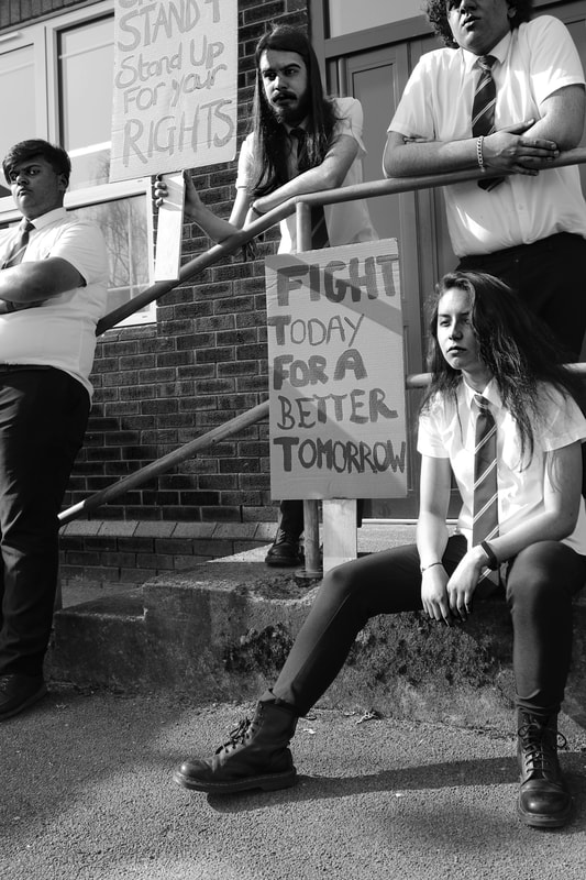
Plan for Shoots:
Name: Emily Moorhouse
Project Title/ shoot number: Protest theme shoot
Description of aims for shoot: I aim to send a direct message through picket signs and text. I want to capture clear and no noise photos which look highly professional. I am aiming to do a range of different images all focusing on racism and feminism.
Links with Photographers: For this shoot I am inspired by the photographer Braylon Dion who is a protest photographer. Through his images he conveys a strong message of inequality. I am going to take some inspiration from his work to inspire my images.
Location: I will be taking my photos in a studio.
Props/ items needed: Picket signs, text, paper, phone.
Kit needed e.g. lighting, tripod, backdrop, macro lens: I will need a dark backdrop (black or navy), tripod.
Camera settings I will use:
F-Stop : I want to position my models very central in my photos so I want my dark background out of focus. So my f-stop will be around F4.0.
White Balance:
I want to do my shoot inside. I will be using a spotlight that will allow me to capture all the minute details.
Shutter speed: I want my shutter speed to be around 1/100 if held with my hand. This will allow me to achieve the best result as too high could change the lighting which would affect the end result.
ISO: I want my ISO to be around 200 as this is just right when using bright light. This will also make my photos look less noisy.
Which compositional rules will I use?
Braylen Dion- I will be taking inspiration
Loira K: I will be working in black and white for some of my shoot like Loira and have something always being the central focal point.
Photoshoot:
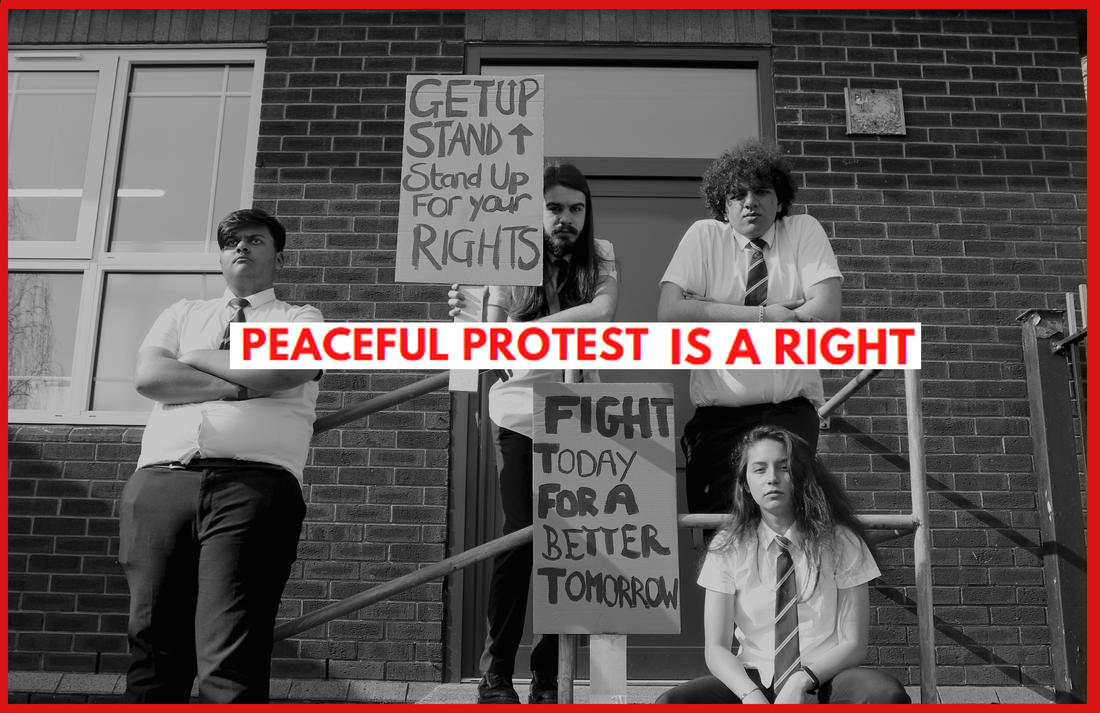
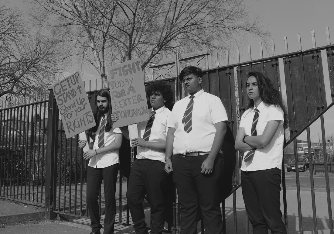
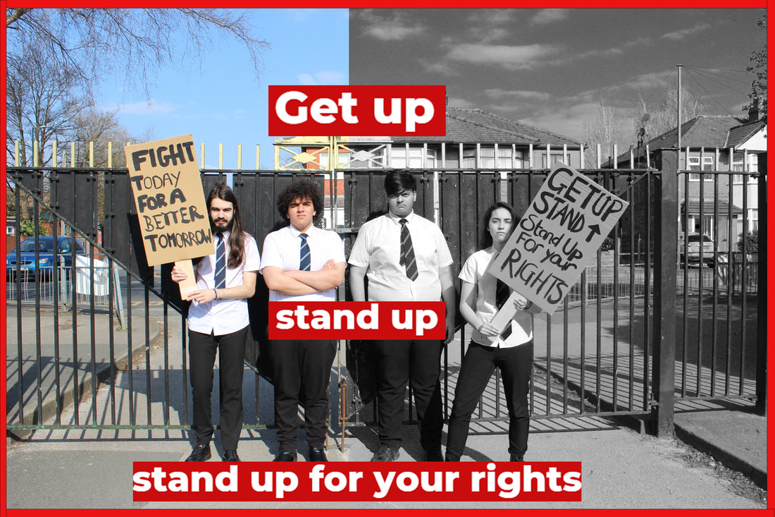
For my shoot I continued the theme of inequality. I created my own picket signs and picked the quotes which I painted on with black paint. I then chose four models to stand in very powerful poses for example with there arms crossed and punching the air. I wanted to make this shoot look very real so I got my models showing emotions through facial expression such as a screwed face. I took photos also from a worm's eye view to show the sense of power due to looking up it also creates a sense of confidence. Purposefully, I chose to have four models to use the rule of even to show the idea of being equal.
"Get up stand up stand up for your rights"- Bob Marley


Best and worst:
|
Worst:
|
Best:
|


|
This is my worst edit because my models weren't ready for the photo. Its more of a candid photo as the sign is in front of my models face. Also I didn't have them positioned in the right way.
|
This is my best because I loved how powerful the image looks. The photo is well balances and well focused so your eyes are drawn to the subject matter. I have made sure to adjust my white balance to the correct setting for outdoor photography.
|


Black and white edits:


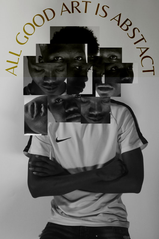
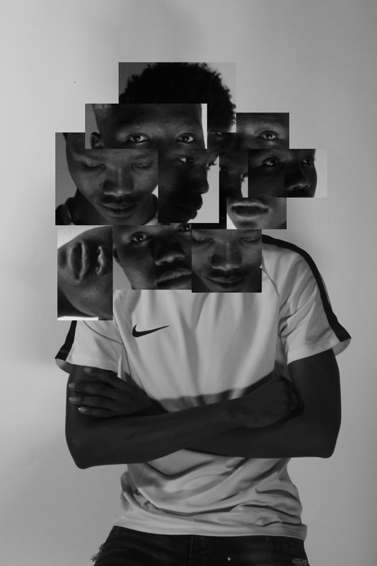
edit 1 Barbara kruger inspired:


Exam:
Edit 1 :MENTAL HEALTH
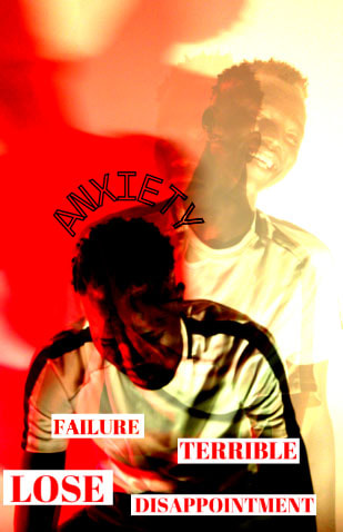
For my first edit I was aiming to captivate a true reality for some people. I aimed to create a piece of photography which would deeply connect to some people so I looked at mental health. I feel like we have all had to face mental health if it was either the effect of Lock-down or the pressure from others around. For this edit I did double exposure to show how sometimes people tend to hide their emotions through a smile. I also used canva for my text to get it in the style of Barbara Kruger who is a well know artist who incorporates lots of text into her work. . I wanted to work in the style of Barbara Kruger as she sends quite direct messages out about big topics which aren't always spoken about and in my opinion I think mental health is one of them. At the moment I can connect on a deeper level due to the stress of exams which are soon approached which I think leaves my work with a much more personal touch on things. I also decided to go with a red colour because the colour has close connotations to love and hate which are two very contrasting things. My photo clearly projects the messages of being okay on the outside but actually deep down struggling. In my edit I used quite hurtful words to show that idea of being down and had them in bold red writing to make it much more visible. I also showed three different emotions in my first far back layer my model is extremely happy. On layer two my model is portrayed to be much more moody by the very much still facial expression. On layer three my model is looking towards the fall to create a very un-confident look and that idea of sadness. I have one word above my models head which is anxiety. Anxiety is a big battle to overcome so I wanted to show its fine to open up to others if anyone's ever struggling.
For my first edit I was aiming to captivate a true reality for some people. I aimed to create a piece of photography which would deeply connect to some people so I looked at mental health. I feel like we have all had to face mental health if it was either the effect of Lock-down or the pressure from others around. For this edit I did double exposure to show how sometimes people tend to hide their emotions through a smile. I also used canva for my text to get it in the style of Barbara Kruger who is a well know artist who incorporates lots of text into her work. . I wanted to work in the style of Barbara Kruger as she sends quite direct messages out about big topics which aren't always spoken about and in my opinion I think mental health is one of them. At the moment I can connect on a deeper level due to the stress of exams which are soon approached which I think leaves my work with a much more personal touch on things. I also decided to go with a red colour because the colour has close connotations to love and hate which are two very contrasting things. My photo clearly projects the messages of being okay on the outside but actually deep down struggling. In my edit I used quite hurtful words to show that idea of being down and had them in bold red writing to make it much more visible. I also showed three different emotions in my first far back layer my model is extremely happy. On layer two my model is portrayed to be much more moody by the very much still facial expression. On layer three my model is looking towards the fall to create a very un-confident look and that idea of sadness. I have one word above my models head which is anxiety. Anxiety is a big battle to overcome so I wanted to show its fine to open up to others if anyone's ever struggling.


Edit 2: Peace and hope
For this edit I was deeply inspired by Barbara Kruger. I used the same form of photography as Kruger by imitating the use of text for effect. I decided red is a very strong and bold colour which really brings the audience in and captivates the audiences eye. I wanted this photo to have a very much focal meaning which is 'peace and hope'. I believe right now this image will connect to many people and touch peoples hearts deeply if they have ever witnessed for or been involved in any kind of way. I felt as a whole this image creates quite a powerful statement as it states the general meaning. To create this image I had to create a red border with the rectangle tool and fill the box with the bright colour red. Then repeated that process four times to create a perfect border for my piece. I then went on to canva to create my text I put my text in white so it is very eye drawing.


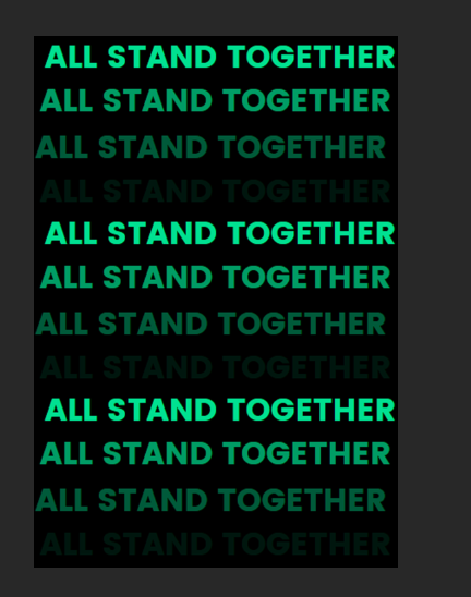
Edit 3:All stand together
This edit I though left a quite powerful statement due to that repetition of the phrase 'All stand together' which is in bold in a green/ teal colour. I wanted to make my image flow so as the words go down they go into a more shadow effect. I decided that this green would fit more accurately with this piece due to it strongly linking to anxiety as its the green colour an anxiety ribbon. Not only that it is also a very bold colour so it makes the work stand out even more. To create this piece firstly I turned my image black and white by carefully identifying what colours I would need to change. I then went on to canva and created a shadow effect text. Then I layed them two together and turned layer two to the setting screen.


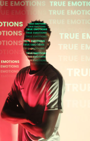
Edit 4: True emotions
For this edit I was inspired by Barbara Kruger because of the use of text which I incorporated into my work to show how peoples minds work. It almost looks like a computer program in somebodies mind. I believe the choice of colour fits very well due to red and green being complementary colours. I believe this highlights a serious issue as many people tend to hid and lock away their emotions instead of letting them out.


edit 5:
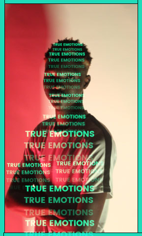
For this edit I used my above edit and followed on I didn't just want to show how your mind thinks but how the world wants you to think and judge. I love in this edit how I used the range of green for effect to create that look of confusion.
edit 6:
For this image I was inspired by Barbara Kruger and her use of text. I love how the text looked with the red from the red light I used while taking my pictures. I had to carefully pick the correct sizing of words. I varied the text size so some stand out more than others. I then created a teal border in the same colour as my text I choose.


Edit 7:
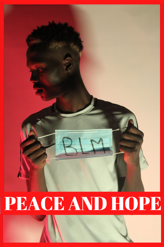
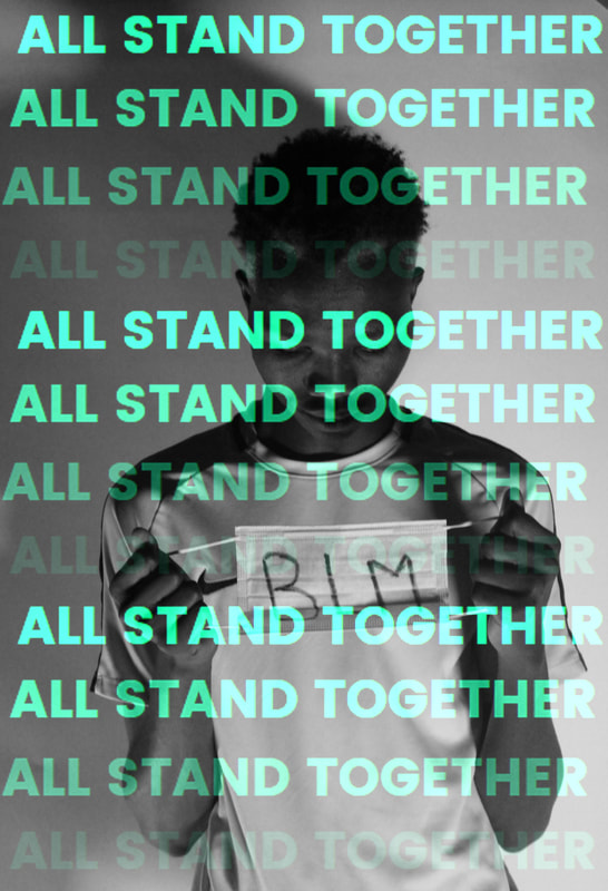
For this shoot I wanted to show a strong message that we should all 'Take a stand'. I choose to put BLM on a face mask to link the idea of us all going through something. I felt using the face mask created a more realistic image.


Cubism:
For my inspiration I chose Frida Kahlo I love her style. I researched her cubism style and loved how her style is extremely different to others. She uses very vibrant stand out colours.


Cubism edit:


Final gallery:


eVALUATION:
I chose to explore the theme messages for this chosen project. I loved this chosen theme because I felt I would be able to express my true emotions towards certain topics in this area. I thought the theme was good because I was able to take images of very powerful things which has inspired me for my third project. In photography I found the use of photoshop the most interesting because I enjoyed manipulating because I enjoyed manipulating my work and improving the images I took. This allows me to expand my skills. I also believed messages would allow me to show my personality a lot more and for what I stand for. I was able to expand my knowledge towards many issues especially feminism and black lives matter. I was deeply inspired by the protests which are happening and many artists who look at Global issues. I loved exploring the topics and searching about extremely important people who have ultimately changed the world today. I researched the suffragettes and looked into how Emily Davidson risked her life for women's suffrage. I also researched lots about racism as its a huge global problem which has sufficiently come to late and has been spoken lots more about. I believe both topics are extremely important which makes my work much more meaningful and from the heart. I researched a range of topics but felt like these two topics were meaningful towards me and would allow my audience to connect to my photos on a much deeper level. I chose to look at a range of different styles such as cubism and experimented with colours, shapes and patterns. Overall, I felt this project opened my eyes to world problems which are still occurring to this very day and need to end. I believe strongly about this idea of spreading messages through photography as its a way to show clear messages. I loved exploring new skills by watching videos on YouTube and also exploring new edits and techniques. If I was given the option to do this shoot again I would love to do a shoot with more people to create a much more protest look.
