My chosen theme for this project is portraits. I have chosen the theme portrait because I find it quite interesting and it allows me to incorporate my own individual style and take on things. This theme gives me the opportunity to work in a more professional way as I will be working with models and using new equipment which will allow me to gain new skills and confidence.
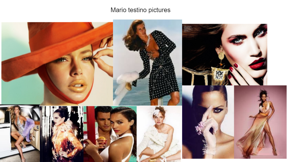
For this project I am going to research varies of different portrait photographers, poses and styles. This will allow me to not only look at a range of photos but also learn more about the artist. For this project I intend to look at a range of photographers I would love to look at the world of fashion in photography. I have recently come across the two photographs Mario Testino and Annie Leibovitz. Both photographers take photos with actors, actresses and many more celebrities'. Mario Testino is a Peruvian fashion photographer and his work is extremely popular in high class magazines such as vogue and vanity fair. I want to take my photos and turn them into magazine or a newspaper so I will look at his work and imitate certain areas. Annie Leibovitz is an American photographer she is most known in the dramatic field due to how much emotion is portrayed through the use dull lightening and physical emotion. I love their unique style because as soon as I saw their work I was enticed as of their unique style. They also take their photos in a way to capture pure emotion. so I will definitely research them and take some inspiration from their work.
For this project I intend to focus on a sports theme I will vary where I take my photos and take some indoors(studio) and some outdoors. I will start incorporating different techniques such as rule of thirds, odds and even to make my photos more pleasing to the eye. When taking my photos I will change the aperture I use depending on how much light I will want entering my photo and what environment I'm in. To develop my project even more I want to use photoshop and photopea to edit my photos with different tutorials either given to me or chosen by me.
Through this project I want to learn more about the theme itself and all the different aspects. I would also like to learn how to use photoshop more as I am new to it so I am not very confident when I use it. So by the end of the project I want to be able to confidently use photoshop and create really complex and sophisticated edits. I also want to start to use different lightening such as using darker and dull lightening to show a sad or angry emotion. The much more brighter bold lightening to show happiness and a positive image.
I would like to organize my final format in a gallery at the end of my page to show my progression. I hope my work is able to inspire my audience.
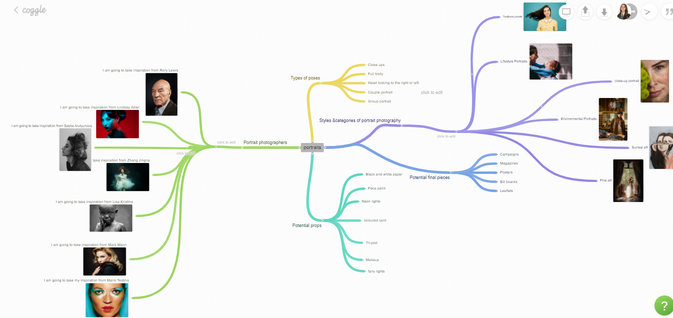
Mind-map:
This mind-map below I made for my portrait project with a good list of ideas I will incorporate for my project.
Photography mock: emily.m

Content:
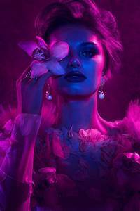
In the photo I can see a young model with very fair skin, bright shiny blue eyes and many freckles. I can also see that a flower has been used to cast a shadow on the model's cheek which emphasizes her smooth skin texture, freckles and shiny lips. The model isn’t really showing any emotions through her facial expressions which could indicate there is a deeper meaning behind why the photographer has chosen to take this photo. The photographer also had their model looking directly at the camera which creates a very strong and powerful effect and changes the overall mood of the piece. The photographer also only captured half their models' face and used the rule of thirds instead of her being central. The photographer chose very harmonious colours as they used a purple flower as it fits with the blue of her eyes and the light pink shade of the model's lips. The background of the photo is a blue to grey shade which makes the models eyes much more vibrant and allows the models pale skin tone to be emphasized. Seen as the model isn't giving us any physical emotions indicating to a topic I think it may be linking to earth and to the word natural as she has ocean blue eyes and pale soft skin. As soon as I saw this image the word 'free' popped to mind due to the look she is giving which is power and strength due to the strong eye contact.
Composition:
The photographer has made it so just half the model's face is shown in this photo to really emphasize her natural facial features. This was very effective as it conveys a more powerful meaning and emphasizes a sense of importance. The foreground of the photo is the branch as it is at the front. The middle ground is the model and the background is a blue to grey gradient. This photographer hasn't used leading lines but they have effectively used the rule of third which makes you instantly look at her eye. Cleverly, the photographer did this to make you drawn straight away to her bright blue ocean eyes. The photographer has used middle ground in this photo since the model is so close to the camera and her face virtually fills the whole picture. I feel like the photographer has used just the right amount of exposure as it has allowed all the models features to be seen and it has almost created this natural feel about the photo. In my opinion I think the photographer has used an ISO around 100-400 and an f-stop around 4 because the background is out of focus and blurred which has allowed the models face to be center of attention. The photographer has taken this image from an eye level view which allows us to directly look at the models face. The colours in this photo are almost all pastels or light and all complement each other nicely. For instance her pink lips, blue eyes and the purple of the flower really tie in together. From the small bit of background in the right hand corner I can see this shoot wasn’t done in a studio. I believe the photographer did this outside using natural light. I feel like the photographer didn’t use a tripod even though the photo is very central and focused. I also feel like the photographer didn’t use a tripod as the model was so close to the camera and I feel like you couldn’t get the photo using a tripod.
Connections:
I like this photo because I love the way the photographer casts the shadow onto her cheek creating this outline of flowers. I also love the way he makes her almost emotionless but also makes her look right into the camera because it makes you think is there a greater meaning behind the photo. One thing I dislike about the photo is the small bit of background in the top right hand corner because I feel like there is no need for it to be in the photo. I feel like the photographer should have cropped the background out to make it look neater. From looking at this photo I feel like the photographer works in a very natural style as this photo brings out all her freckles and skin tone. I have started working on portraits so for my next shoot I am going to start experimenting in different photographers styles. When taking my own photos I will incorporate the strengths such as using shadows for effect and using the even better ifs to allow me to extend my knowledge and improve
Inspirations:
I would love to take inspiration from this photographer and take some similar photos in this style. I will try taking my models face close up to capture those aspects of the face you can’t get from far away like eye colour and freckles. I will use this photo in particular and experiment with shadows as I loved how in this photo the photographer used a flower as it makes the photo seem unique and a bit different. I also want to start doing close-up portraits as at the moment I have been doing full body portraits. When imitating this photographer I would use very cool and calm colours which don’t contrast as when I look at the photo I see a very peaceful array of colours which are pleasing to the eye.
Magdiel Lopez:
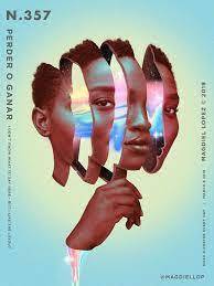
Context:
This photo was made by Magdiel Lopez (who is a photographer). He was born on the 28th of August, 1989 in Havana. Magdiel Lopez spent his younger years surrounded by the Cuban culture which has inspired his very bright, colourful and unique style. Lopez is an artist who specialises in both digital and print work, which creates this distinctive style. This has enabled him to vary the ways in which he takes his photos and additionally how he edits them, with a range of special effects. At 15, Madgiel Moved to the US where he began to create all his work. Madgiel wanted to make a series of his art to show his audience so he began an Instagram page and posted a new piece of his art . This piece above is day 357. The use of posting so frequently led to more attention being brought to his work. I strongly believe this image was inspired by his childhood, as it is very vibrant and quite unusual, which reminds me of the Cuban culture. You can see by looking at this picture, that his individual style and imagination is very different to other artists. However, in my opinion I believe his bold choice of colours links to Mario Testino because he also uses a variety of vibrant colours in his work too.
Content:
This photo is called "Perder O Ganar'' which is a Spanish term. In English "Perder O Ganar '' means to win or lose. Lopez not only wanted to show a piece of abstract art, but he also wanted to show a deeper meaning behind his work. When I first saw this image, I saw a woman's head which had been distorted and split into sections showing the contents of her busy mind. However, when I learnt the deeper meaning behind this picture, what the title meant and more about the artist I could see and feel the power the image holds. It shows how sometimes you may fail or it may work out. I love how Lopez shows what's happening in a person's mind and how we all have a lot going on in our heads. You can see through this image especially how he takes modern art and portraits and blends them together. The use of a neon colour palette and vivid colours draws the viewer's eyes to certain points in the picture which emphasises the area Lopez wants to draw our eyes to. The harmonious colours where used not just to draw you in but to spread emotion as Lopez used blue for the background which links to sadness and all the other bright colours to show an explosion of emotions. Lopez uses two aspects of art the first one is abstract art as he has used bright vivid colours and shapes to display a depiction of something which occurs in real life. Which links to the surreal aspect as the image is sharing emotions and true things people go through.
Composition:
Lopez arranges his work quite centrally which captures the viewer's eye straight away. In this specific photo his model is looking directly into the camera which creates a very strong and powerful effect because you feel like the model is directly looking at you. This shows how Madgiel has thought of how his audience will feel towards the image and how to make them understand what he is trying to portray. Additionally, he has placed his model in a rule of third and not directly in the middle Magdiel has really embraced the space in his photo by putting his models head quite central but having one of her hands underneath. Even though Madgiel only used one of his model's hands in the photo he has still been able to create a more balanced effect. When editing his photos he has split his models head in even layers which makes the photo seem very neat and organized. Even though he has edited his photo I can still see this photo was taken in a studio. I think he may have used a tripod as the photo is extremely centered and clean. He has also used a very fast shutter speed to create that sharp photo and low ISO to around 200 to get that better quality photo. For this image the photographer has used photoshop to edit there photo by firstly using the cutting tool to remove all the body and to be left with the models face and creating four layers and then using mask tool. Then Lopez would have had to select the portrait and using eclipse tool to where they are being cut up into. Then when the face is cut up he would us the arrange tool to place the pieces into a specific place. Then as the pieces are 3D he would have used the eclipse tool and filling them with colours.
Comment:
When I first saw this image I thought the use of vibrant colours was really effective as I was instantly drawn to his photo. Furthermore, I also really liked the unique style the artist has and how he shows a story through his work which links to most people's lives. I will link to Lopez's work because I have started a portrait project and want to experiment with my colour choices and what style I want to use. I am also taking pictures of bright objects and editing them into something a bit different to see my take on things. When I first came across this photo I was a bit confused on what it was showing but after research about the image and the background of the artist I understand what he wanted to show to his audience how sometimes it works and sometimes it doesn't it is hard to understand that meaning from the photo but you can almost see a busy mind which looks like it's going to explode. I would love to imitate some of Madgiels Lopez's work as I really like that uniqueness and how he takes a photo and turns it into something completely different.
Mario Testino:

Context
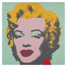
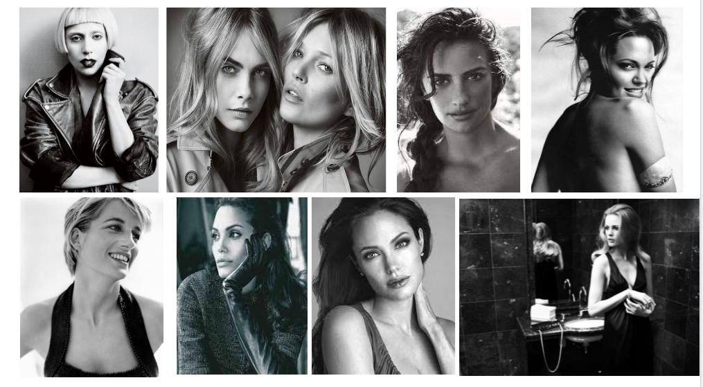
This photo was made by Mario Testino (who is a fashion photographer). Testino was born 30th of October 1954 in Peru. Mario Testino is well known for working with fashion models and extremely important people like Princess Diana, Cara Delevingne and Kate Moss. Testino has a very different style and brings out all the features of his models. This photo above is called “In your face” and it was one of many which was taken between 20 January - 26 July 2015. Mario Testino takes his inspiration from Cecil Beaton, a British fashion designer. Beaton had an extremely elegant and graceful style and mainly worked in black and white. Above I have also put a picture that Andy Warhol did of Marilyn Monroe when comparing the two I thought Testino and Warhol had a similar take on things and were quite similar. I thought this because they both used a significantly bright array of colours for their models makeup and both had a bright background. Not only that they have both used very big icons of the times. To me I could see how pop art was also used to inspire and influence artists. Pop art culture was huge due to the huge singers such as Elvis Pressley and actresses such as Marilyn Monroe used. Testino has used Kate Moss as she not only is a top model but ultimately described as 'an icon in herself' which links to her chameleon style which influenced many people around the world. She is in the history of fashion and inspires many big designers such as Vivienne Westwood which shows how big of an influence she is so that why Testino did it to draw attention and show Kates personality.
Content:
This photo above is a portrait of Kate Moss (Who is a British supermodel). This portrait is called "In your face" and there is a big correlation to the name and the picture. He has used very bold colours on Kate's face like light blue, green and white around her eyes. This strongly defines her eyes and makes the colour pop more. He also used a very strong daring red colour on her lips which was a very powerful statement and it's a way to complement her skin tone. This picture is extremely striking and courageous. This series of “ In your face” is there to show Testino's diversity and innovation. The abstract eye-shadow colours bring out her hazel coloured eyes. Testino has also used a very strong vibrant blue as his background which contrasts with the other colours used which makes them stand out even more and emphasizes her facial features. Testino also chose to use green and red which are complementary as they pair nicely and make on another stand out. I believe Testino chose to incorporate makeup to not only be bold but to show how powerful women are and we aren't defined by what we look like. When I first saw this piece I could see a close connection with Andy Warhol's piece with Marilyn Monroe due to the use of bright makeup which are eye-catching and striking. I could also see the resemblance in facial features.
Composition:
Mario Testino has used a central focal point to extenuate his models features as his model has very large round hazel eyes. In addition, he has also used contrasting colours for the background and face which draws your attention even more. Mario Testino has Kate Moss staring centrally into the camera which makes the audience feel like she is staring directly at them. Testino has used a very bright light for this photo ( it seems to be a studio light) which highlights the models eyes even more and tone of skin. He has also mad a much more positive mood by the tone of light as usually bright lighting boosts your mood. Testino has used a broad depth of field to create a very sharp and focused image. Since Testino has his model very central it creates a very balanced feel towards the photo. I believe he used a tripod to take this photo because of how sharp and portrait photography is all about focus and precision and that's what tripods do.
Connection:
I really like how Testino used bright makeup to bring out his models' features as it not only draws your eyes straight to the image but it creates a bold statement and draws your attention. I have been focusing on portraits recently so this work links to mine as we both are doing portraits and In some of my edits I'm making them much brighter and vibrant and focusing on features I want to make more prominent. For a future shoot I want to take inspiration and try to use much more vivid colours on my photos in just certain areas . I will start to focus on the position I hold my camera to see how much of my models body I want to include. In addition, I will also start to look at the positions I put my model in and which one suits them best.
Lindsay Adler:

Context:
This photo was taken by Lindsay Adler of Carol Mendes. Lindsay Adler is a portrait and fashion photographer from America. She was born on 17th September in 1985. She was first brought into the art industry early in life at around 15 years old. She went to art classes and wanted to create a business to show off her big passion for photography. This enlightened her to know that she is a true artist and sparked a major interest in photography and especially fashion. This photo above was taken around the 22nd of October 2018. This photo was made to show audiences how strong women are even if they are shown to be the opposite. This also brings up political aspects because in the past women were seen as fragile and small. To me this piece of work by Adler links to a poem by Maya Angelou called "And Still I Rise" which emphasizes the same message of which Adler is articulating to her audience. When looking at this photo you can tell its been taken in a studio because of the shadow created across her face.
Content:
This photo above was of Carol Mendes a model. This photo was created to show a strong sense of empowerment and femininity which is displayed massively. Adler has a very clear meaning to her work and species a certain topic which was “being both soft and strong is a talent that few have mastered.” She has a very graphic and bold style which makes her work stick out. This photo is showing a famous angle of Adler's which is a 'hero angle'. The 'hero angle' is another word for a low angle she used this to make the viewer focus just on her model and no surroundings which are around. Lindsay Adler works with a variety of advertisements, campaigns and different models and designers. Adler not only aims to create good, focused and sharp photos but to also capture a message. For the image above she wanted to show the theme empowerment through portrait photography. This photo is only in black and white to me makes it stronger because it draws no attention from the model. There has been a shadow of light cast across her face which shows it was taken in a studio and exaggerates that specific area of her face.
Composition:
She has placed her model very central and near to the camera which allows just the model to matter in that moment in time which is extremely effective. She has also made the model not sit looking directly at the camera but at a slight angle which makes it seem a little unbalanced but it also allows the audience to see his features more such as he sharp jaw line. In addition, Adler also experimented with the light used to make one section of her face to stand out more than the rest which specifically draws your attention more. This also allows features such as her eyebrows, eyes, nose and lips to be more prominent. I also saw the models skin teacher as in the brighter lighting her skin texture is shown much more whereas in the darker lighting its almost hidden to maybe show power. The model has very dark features so by using a stripe of light it makes them attract the eye more and become more bold. This may have been done on purpose to create the greater idea of strength and showing the true beauty as no colour was used it makes the photo seem more meaningful because it gives no context but we can see strength in how the model is positioned.
Connection:
On my first view of this picture I really liked how she used lighting and shadows for affect as it really brings out certain aspects of her face. I also like how she just used black and white as its powerful and doesn't take any focus away from the model. I am focusing on the topic of portraits and Lindsay Adler specializes in portraits too. I want to start using light more frequently for shadows and intensity. I would also like to create a photo with a deeper meaning for the audience to connect to and understand.
Sports wear:
Poses:


Movement:


Plan for Shoots
Name: Emily Moorhouse
Project Title/ shoot number: Sports wear shoot/ portrait shoot
Description of aims for shoot: My aim for shoot is to take clear photos of people in different poses wearing sports wear.
Links with Photographers: I want to take inspiration from Lindsey Adler as I really like how she uses lightening effectively to really bring out her models facial features. I also want to imitate Zhang Jingna as I like how she effectively uses the space.
Location: I will be doing a studio shoot.
Props/ items needed: The props I will need are ports wear, makeup, basketball and a football.
Kit needed : The kit I will need a clear background, tripod, camera, battery and lighting.
Camera settings I will use:
F-Stop : For some of my photos I want my model to be positioned in the center with the background out of focus. So my f-stop will be around F4.0. I also will also change where I want my model to stand and the pose they are gonna do.
White Balance: I want to do my shoot inside in a studio. I will be using a spotlight that will allow me to capture all the minute details.
Shutter speed: I want my shutter speed to be around 1/100 if holding with my hand. This will allow me to achieve the best result as too high could change the lighting which would affect the end result.
ISO: I want to set my ISO to around 200/300 as that will allow me to get the best shot with a light and it will make my photos sharp and less noisy.
Which compositional rules will I use? I will be taking some of my photos from different perspectives (worms eye view and a birds eye view) this will allow me to show the viewer what my model looks like from different angles. I want my model in different poses and I will position them sometimes in the center and other times I will use rule of thirds this will make my photos look more evenly balanced.
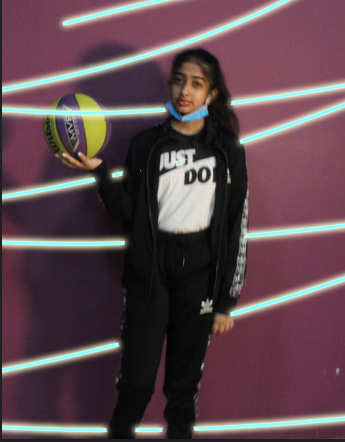
portrait Photoshoot:
Purple backdrop:


|
Best: I believe this is my best photo because I like how I was able to cast a shadow onto the purple background. Purposely, I used a central focal point and a purple backdrop to make sure no attention is drawn away from the model. I also believe the color purple s extremely vibrant so it will make my model pop and stand out.
|
Worst: I believe this is my worst photo because its extremely blurry and I don't like the angle I took my photo from as it has made it look messy and noisy. I was trying to do a birds eye view however in this photo as the floor isn't plain it slightly draws the attention away from the model. Next time I will hold my camera steady in my hand and hold it at a birds eye view.
|
Yellow backdrop:


|
Best- I feel like its my best photo as the colours on the models outfit really complement the yellow backdrop. The yellow backdrop is extremely vibrant and bright which draws a lot of attention straight to this photo due to the vivid use of colours. The blur highlights the colours on my models clothing.
|
Worst- I believe this is my worst because its blurry due to movement. My model was unprepared as he is moving and the object is also moving so next time I would use sports mode on my camera to be able to get a clear image but still capture the movement with less noise.
|
Outside shoot:


Photo edits:


GROUP pROJECT:
Plan for shoot
Name: Alex Clark, Emily Moorhouse, Amal Ahmed and Laaibah Mohammed
Project Title/ shoot number: Group Portrait shoot.
Description of aims for shoot: To imitate portrait photography of different photographers, experiment with new equipment and work with a professional photographer.
Links with Photographers
We are hoping to imitate and recreate photographs by Mario Testino and Annie Leibovitz.
Location: Studio Shoot.
Props/ items needed: Fashion accessories.
Kit needed e.g. lighting, tripod, backdrop, macro lens: Backdrops, canon 50mm lens
Camera settings I will use:
F-Stop :It will vary from photo to photo however I think we will need a low f-stop as for most of the photos the background is out of focus.
White Balance: It will vary from photo to photo however I think we will need a low f-stop as for most of the photos the background is out of focus.
Shutter speed: As it is a studio shoot we may use fluorescent but it may vary depending on the specific lighting on the day.
ISO: Since we are not trying to capture any movements in the photograph, we can use a fast shutter speed (such as 1/1000) to avoid any blurring.
We do not want to capture too much grain in our images so hopefully we can use 100 or 200.
Which compositional rules will I use?
We’re hoping to take photos with a central focal point and utilizing the rule of thirds for our framing, asymmetry for most if not all photos.
Since we are not trying to capture any movements in the photograph, we can use a fast shutter speed (such as 1/1000) to avoid any blurring.
We do not want to capture too much grain in our images so hopefully we can use 100 or 200.
We do not want to capture too much grain in our images so hopefully we can use 100 or 200.
Plan was made by Alex Clark.
Mood boards:
Done by Amal Ahmed.

Done by Laaibah Mohammed.
Lindsay adler:


Mario Testino:


zhang jinnah:


Plans for shoots:
Vogue covers:
I want to make some magazine covers using the photos I have used and turn them into modern vogue magazines and more vintage and retro NME magazines.
NME covers:
Photoshoot with Justin:
Set up for shoot with Justin:
Here below is my group and I setting up the equipment with Justin. As you can see we did the shoot in no studio but yet still made the photo clean and very professional.


Photoshoot 1:
Model: Alex
Model: Alex
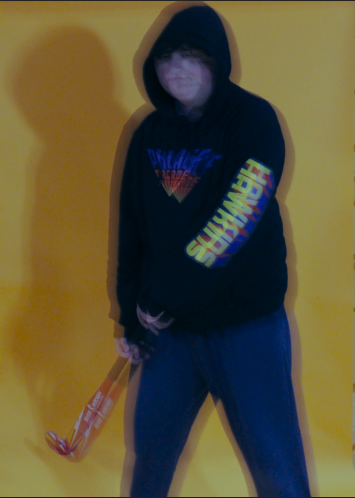
For the first shoot I took pictures of Alex for this shoot I had a very retro idea for this shoot so the clothing really worked with the style I was going with and I was able to get the outcomes I wanted to get.


Photoshoot 2:
Models: Alex and Laaibah
Models: Alex and Laaibah
For the next shoot I took photos of Laaibah and Alex I had an idea of putting them back to back which makes them seem much more simple and flowy. It also show height and creates a softer photo to look at due to it also being in black and white.


Street photography:

Black and white portraits:


Plan of shoot:
Imperial War Museum :


|
Best photo:
Best photo:
I believe this is my best photo as I love the pose I put my model in as it looks very professional and put together. I also love how the background is plain which allows the model to be center of attention. The white balance was changed to natural light which allows the natural light to cast onto her skin. |
Worst photo:
Worst photo:
I believe this is my worst photo as my model is moving and she isn't ready for the photo. The camera wasn't on the right setting. The photo is much too bright and her face is blinded by the light. |
Salford Quays:


Media city:
|

Best photo:
I believe this is my best photo as I love the pose my model is in as its extremely professional and have taken it at a worms view as my model is high up. The f/8 to f/11 range as it is sharp. I love how my model has very happy facial expressions which is highly projected. |

Worst photo:
This is my worst as model isn't prepared as she is holding a piece of equipment (camera). I also have caught my other model in my shoot which wasn't supposed to happen and she doesn't look prepared in the shoot. |


Best photo:
I believe this is my best photo as I used worms eye view to take it and I love the pose my model is standing in as its very natural. I also like how buildings are in the background. I also love how interesting the photo is due to the use of a lower viewpoint and the colours in the photo all work together really nicely. |

Worst photo:
I believe this is my worst because my model is moving and she isn't in the center which I aimed for this photo. Also you can tell I didn't time the photo well as my model is unprepared as she isn't ready for the photo. I will also need to change my shutter speed to a faster speed so that there is a camera shake. |
Lowry:


|
Best photo:
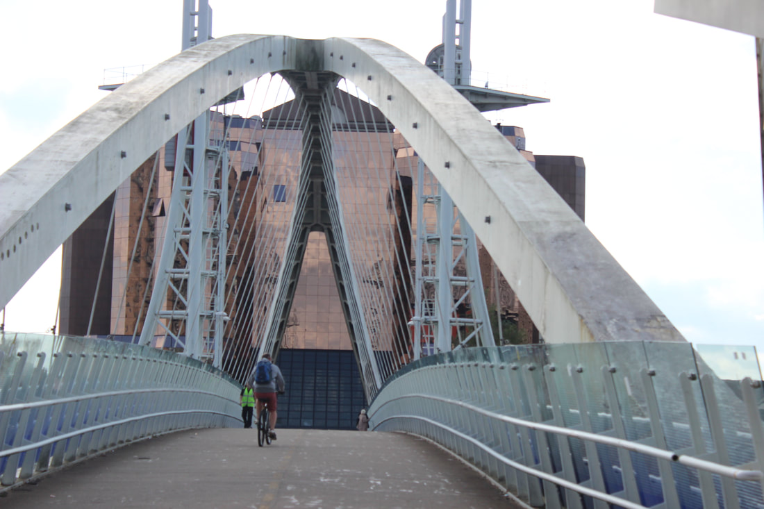
Best:
I believe this is my best photo as I was able to capture a moving biker by using sport mode on my camera. I love movement photos as they not only capture the movement but also the surroundings. I also love how I was able to capture the bridge in a symmetrical way as it creates a sense of equality. |
Worst photo:

Worst:
I believe this is my worst picture because my model isn't prepared for the shot and there is a lot of things in the background. I also didn't have the right white balance because my shoot is too bright which doesn't allow us to see the background of the image. |
Edits:
Colour splash edits:
The 'Colour splash effect'. by Brendan Williams
https://www.youtube.com/watch?v=bY50Ry7GCNw
The 'Colour splash effect'. by Brendan Williams
https://www.youtube.com/watch?v=bY50Ry7GCNw


For the edit above I had to copy the background layer and then use magic cut to allow me to remove the colour from certain parts of my edit. This leaves just areas of colour which creates dimension. I had to use the colour selector to make sure I was only selecting the specific areas I wanted to highlight.


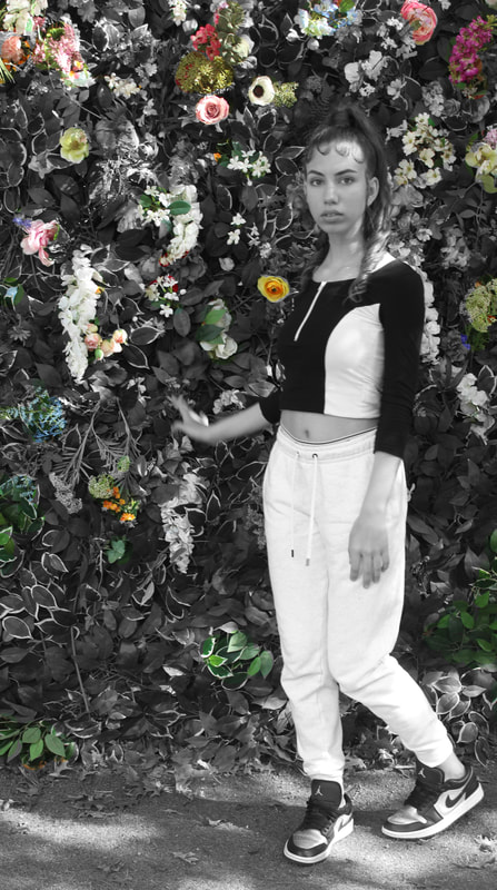
Double exposure:


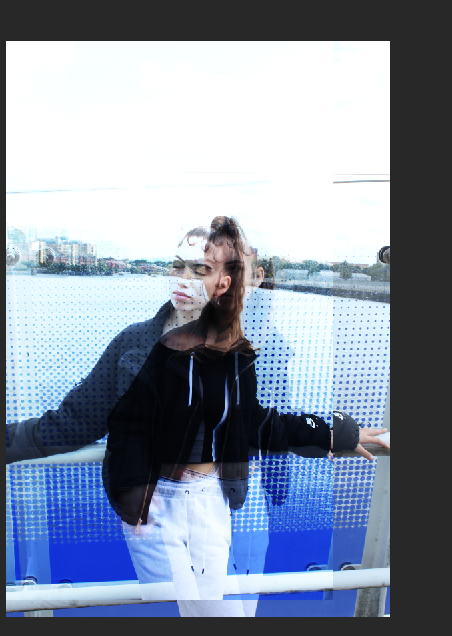


For this edit I did a double exposure edit using photoshop. I wanted to combine natural texture to portrait photography. I used a flower (which I took) as my background. I then laid my model on top and changed the setting to overlay for the perfect blend I then thought I wanted more of a nature feel due to my model being outdoors which already creates the sense of being free. So in this case I got a photo I took of a leaf with lots of texture on. I then changed the setting to soft light which makes the photo blend with the background and flow more. This allowed me to not only combine two types of photography but also create a double exposure photo.
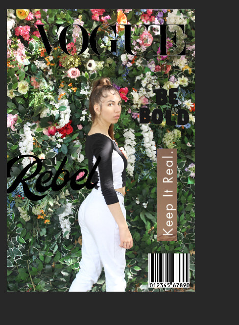
Magazine covers:


For this photo I had to use magnetic lasso to carefully cut around the name 'ALEX' as I wanted to make a magazine feel for the image. Then I had to write the text I wanted. Before writing the text I researched retro band magazines to make my picture more realistic. I had to get the NME logo offline and use the cutting tool for each letter to get a neater affect.
Magazine covers:
Here bellow is a gallery full of magazine covers from vogue which I aspire to mimic when editing my photos. When looking at the images I can see the models are all positioned in a powerful way which may be to show power.


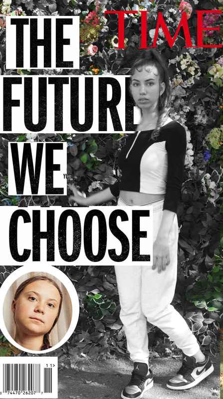
On the edit above I used photoshop to turn a image into a wider global issue which a audience will connect to making it a much more interesting photo.


This edit I did using photoshop. I used quick select on the text which I got off the internet. I then began to experiment with my placements to give it a more magazine feel. I chose to make this photo more targeted to the younger generation due to the type of text and colour which will draw more attention from teens.
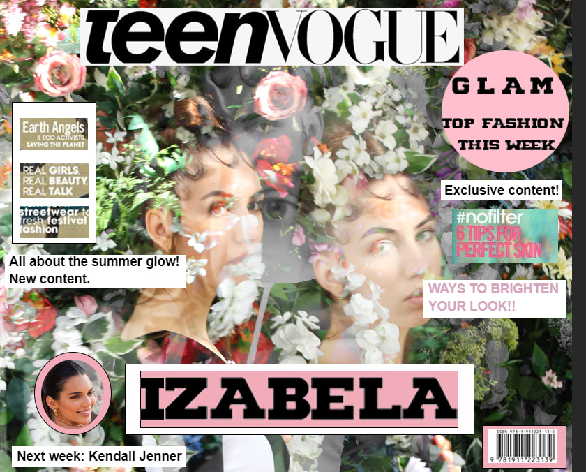


For this edit I used photoshop because I chose to combine two of my edits which was a glitch/ mix of photos and a magazine cover. This makes a very fun and interesting look as there is so much it includes. For this I got the teen vogue title offline and cut it to the size which I saw fit. Then I looked at colours which would complement and I chose pink, white and black. I used magic wand tool on the letters to select each one and turn it to size.
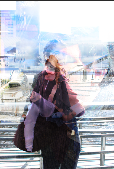
Mock exam:
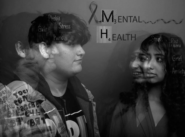
For this edit I wanted to focus on a very big project which is mental health. I decided to focus on inner thoughts and how people are sometimes unable to show there true feelings. I chose to do double exposure and experiment with using three photos which I captured where there's three completely different emotions. I chose to incorporate text and make it a campaign relating to mental health awareness. I used magic wand to cut my text out and for my two scrabble letters I used polygonal lasso tool to carefully cut them out.


Final gallery:


Evaluation:
I chose to explore the theme portraits for this project. I loved this chosen theme because I learnt so much about other portrait photographers and I was able to expand my skills on how to make a picture look very focused and clean which has allowed me to capture highly developed images. I really enjoyed taking part in doing a professional photo shoot with a photographer named Justin as we not only experienced how to model but how to take photos using a tripod and special light equipment. This shoot allowed me to get photos which looked extremely professional and well focused with no noise present. I am very proud of my progression in photography and this project allowed me to get more highly developed images and get more relaxed and comfortable with the editing process. I have attempted many complex edits by watching you tube videos and recreating them with my own take on things. I also did combination edits where I was able to test different photos together and get different outcomes that allowed me to create more detailed images. I also chose to make one of my edits much more personal and truly to articulate a message of Climate change because it's a huge Global issue which I wanted to portray through art. So I hope my viewers can understand the clear meaning and see the emotion. To develop my project even more I would like to complete more complex edits. I would also like to make my images more meaningful so I will try to make edits regarding certain topics which will connect to others. For this project I chose to research Madgiel Lopez, Mario Testino, Lindsay Adler and Zhang Jinnah. Each photographer has their own individual style and comes from different backgrounds which ultimately makes their style. For each photographer I researched I looked at their photos in depth then researched the meaning behind them which allowed me to take some inspiration for my own shoots and edits. My most successful part of my project was my shoot with Justin because it allowed me to get a real feel for the project and I had a great learning experience. I was deeply inspired by Mario Testino during this shoot due to the strong and powerful emotions which are portrayed through facial expressions. I also believe my analysis was a successful part of my project. I made sure I wrote in great detail and explained my ideas in detail. In this project I did encounter a few areas of problems such as for one of my edits I found it hard to get it looking exactly right and for some of my shoots I found photos which were extremely out of focus. Through these problems I learnt that nothing has to be perfect or exact and how to overcome any issues I have. So I made the edit into something new by taking a different approach if it didn't work out for me. If I was given the opportunity to do this project again I would do more shoots which allow me to vary the edits I could have done.
